We have a unique way of working with our clients. We are a solutions provider, so much more than just being a supplier of architecture and design services. We like to work alongside our clients and other design professionals. This collaborative business culture is geared to smarter ways of operating, enabling us to achieve high standards of delivery and performance within budget and time constraints.
Sustainability is a core component of all our work. Our award winning architects look to maximise the opportunities that a site reveals. This results in buildings that comprise creative environmental, space or cost saving solutions.Photo-Mosaic House
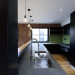
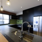
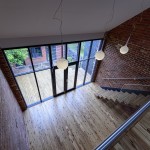
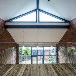
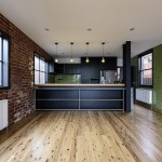
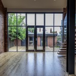
This project involved the renovation and extension of the Victorian home of leading photographer Tony Zara and his partner Phyllis Rossis. The couple wanted a Modern industrial extension, adding a second storey and making use of the existing footprint. Extensive negotiations were required with the local council in order to achieve the stunning result. This is an interior design that is all about frames. The design was conceived as an expression of the couples creativity. Tiles are used extensively and ingeniously in the design. The brick pattern of the glazed tiles is melded into the old wall.
The project won the BUILD magazine award for Best Residential Renovation in 2018.
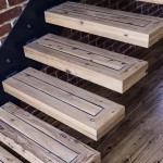
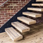
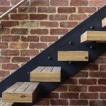
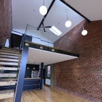
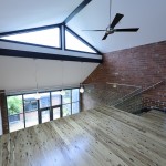
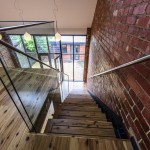
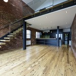
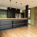
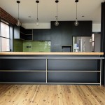
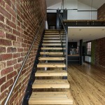
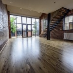
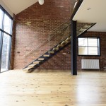
Glazed tiles were the primary design material. The project also incorporated a hanging stair in timber, steel and glass. Recycled timber was used for floors and the kitchen bar top.
The citation from the Jury is below
Company: One20Group
Award(s): Best Residential Renovation (Victoria): Photo-Mosaic House, Ascot Vale
”This year’s Architecture Awards have once again cast a spotlight on the exceptional and ground-breaking work undertaken by the world’s leading studios, practices and designers. Your success is an unmistakable achievement, a true testament to your contribution to the industry”
- Stair Detail
- Cantilever
- Treads
- Above Stair
- Kitchen
- Kitchen Ascot Vale
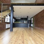
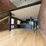
- Living
- View to Outside
- Double Glazed Steel Doors
- Clearstorey Windows
- Top of Stairwell
- Living
- Bench Storage
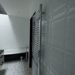
- Bathroom
- Shower
- Bathroom
- View to Backyard
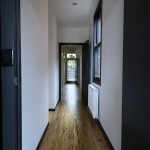
- Restored Hallway
- Kitchen showing stitching of brickwork
- Kitchen Bench
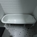
- Restored Clawgoot Bathtub
- Bathroom
- Stair and handrail
- Living space
- Cantilever stair
- Living
- Living
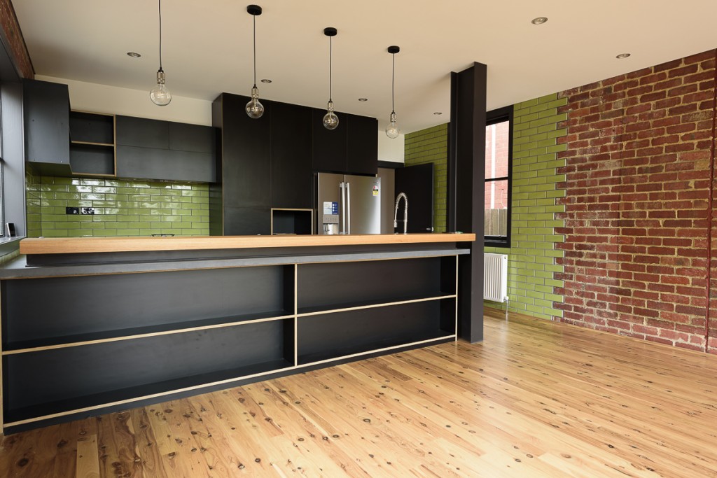
Kitchen showing stitching of brickwork
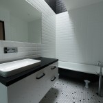
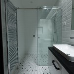
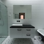
This project is about the modular nature of tiles and the views that can be frames by their patterns. Black and white hexagonal tiles were used in the bathroom and laundry to create a random pattern that draws the eye to various focal points. In the living areas the new glazed tiles intersect with the old brick patterns to emphasise the difference between old and new.
This Project was the interior design of a house for a photographer and a mosaic tiler. The design was conceived as a way to frame views and highlight the use of tiles. Glazed tiles were used on the brick walls. The new tiles finger into the old emphasising the juxtaposition of the two. The building is experienced as a series of framed views. Like a photographer’s portfolio it reveals itself as a series of vignettes.
The challenge was to see how can a 4d object that is viewed and experienced by the body in space and time be broken down into a series of 2d images and experiences. The old brick walls were built in an irregular pattern with little consistency in the mortar joints. Care needed to be taken in placing the new glazed tiles over these bricks in order to give the impression of the tiles and bricks dovetailing into each other.
TEAM MEMBERS :
Adrian Light, Luca Calvanese and Lorelei LE Berre Soule
